Sector(s)
Team Members
Project Team
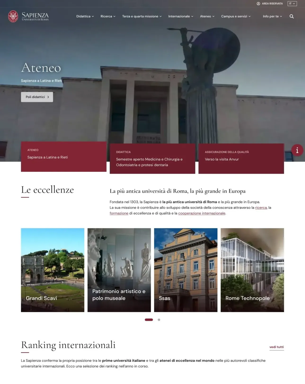
- Sapienza University of Rome: client and owner of the project, strategic direction, content, validation of the identity and navigation choices. The homepage redesign was coordinated by the university's web editorial committee (Comitato editoriale web).
- SparkFabrik: qualitative audience analysis, visual and content direction, design system foundations, design of the homepage and of the first menu levels, front end development.
Team members without a drupal.org profile: Silvia Marinelli, Davide Salvadori.
Visit the site
Visit the siteOrganizations Involved
Community contributions
The team behind the platform maintains or contributes to more than 25 modules on drupal.org, many of them dedicated to AI, and holds over 1,000 contribution credits. SparkFabrik is a Drupal Certified Partner Gold, the first Italian company to earn the certification, co-organizes DrupalCamp Italy and speaks at DrupalCon and Drupal Dev Days.
Sapienza University of Rome has 11 faculties, 58 departments and more than 125,000 enrolled students. Its website is the main digital point of contact for a vast and diversified audience: Italian and international students, families, academic and administrative staff, media and the scientific community.
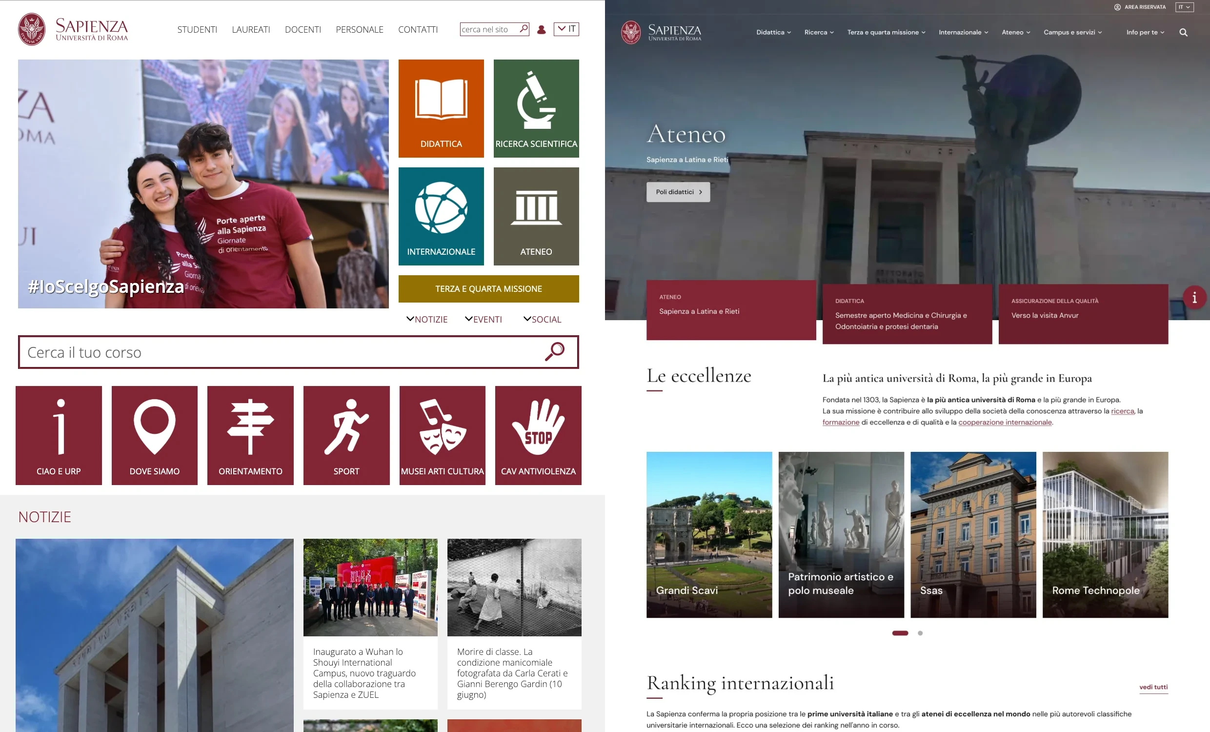
The previous homepage had run on an old version of Drupal for years. At its core was a mosaic of news items and boxes that put everything on the same level, and people reached content through external search engines rather than through the site's own navigation.
The project delivered the audience analysis, the visual and content direction, the design system foundations, the homepage and the first menu levels. Foundations first, then the first page, then the rest of the university website.
About the project
Goals
- Define design system foundations valid for the whole future website, not only for one page.
- Replace a homepage that put everything on the same level with a clear hierarchy.
- Serve two audiences without one crowding out the other.
- Make navigation reachable straight from the homepage, on a desktop and on a phone.
Challenge
Two different needs compete for the first screen. Students arrive with very concrete needs: enrolment, course attendance and campus services. The scientific community, institutions, schools and media look to the same page for authority and for the visibility of the educational offer, of research and of social impact. The work started with a qualitative analysis of the audience, mapping each audience group with its own needs and its own language. The homepage hierarchy comes from that map: what deserves the first screen, and what can wait.
Solution
- Design system foundations documented once: a palette built from the institutional Sapienza Red into an eight step scale, a serif and sans typographic pairing, spacing and grids designed mobile first, tone of voice, and accessibility as a design criterion for every component.
- A homepage composed in bands, where the university's areas of excellence and its four missions take the foreground, with room in the same scroll for inclusion and scientific output.
- Navigation that does not hide: the menu is exposed down to the third level, and a menu dedicated to the different audience groups stays in plain sight.
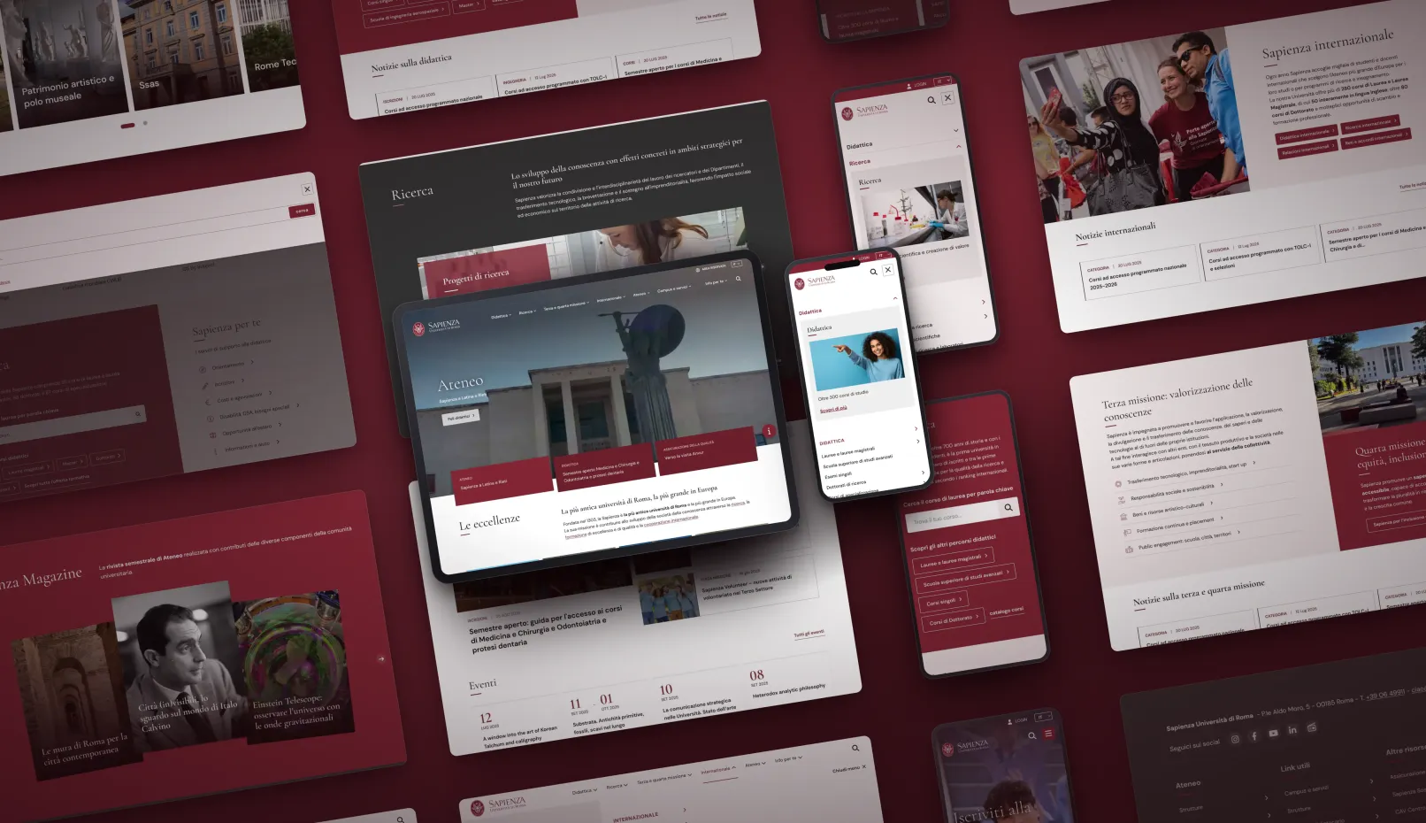
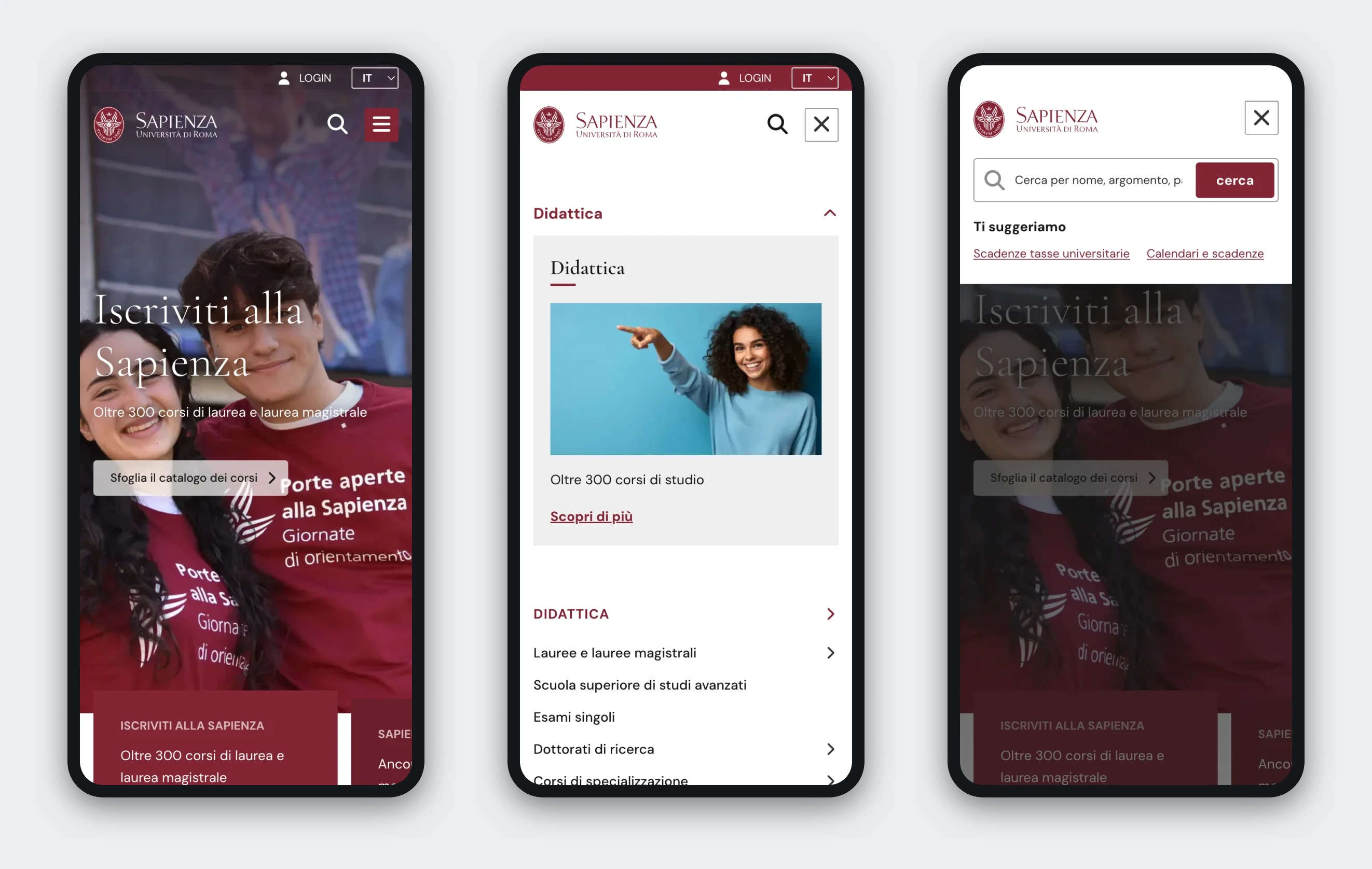
- Four breakpoints designed one by one, from 393 to 1512 pixels, with a three level mobile menu and a search overlay, because the hierarchy that works on a desktop is not the one that works on a phone.
- The content model in Drupal, with the content types and Paragraphs that compose the homepage: that is where the editorial team decides what to feature, reorder or replace.
- A front end rebuilt from scratch that consumes that content and applies the rules of the design system, so the foundations become the behavior of the page.
Outcome
- Five documented foundations, the shared base for the whole future university website.
- A homepage approved in its visual and functional composition, and the reference for the first menu levels.
- Four breakpoints and three menu levels exposed from the homepage.
- Two audiences served under a single identity, with accessibility applied to every component.
Designing the homepage of a university like Sapienza means deciding what comes first. Doing that required shared foundations: without them, every page that follows would start over from scratch.
Stefano Mainardi, CEO, SparkFabrik
A short video walkthrough of the new homepage, in Italian:
The full case study, with the audience analysis and the foundations in detail: Sapienza University of Rome on sparkfabrik.com.
Why Drupal was chosen
Drupal already ran the site, and the redesign confirmed it as the content backbone instead of replacing it, so the work could go into hierarchy, foundations and navigation rather than into a migration. Drupal met the specific needs of the project:
- A structured content model, so the homepage is composed from typed content instead of being rebuilt by hand.
- Modular composition already available in the CMS: dedicated content types and Paragraphs let the editorial team decide what to feature, reorder or replace, with no developer in the loop.
- A clean separation between content and presentation, which let a front end rebuilt from scratch consume the same content model.
- Open source and open standards, which for a public institution means no licensing cost per editor or per site and no dependency on a single vendor.
- Granular editorial permissions, for an organization where many offices contribute to the front page.
Technical Specifications
Key modules/theme/distribution used: